The online financial services space is known to be a tad stuffy at times. Cookie cutter websites that generally reek of boredom seem to be everywhere, and they make it difficult to attract users and qualified customers.
If you run a financial firm and are finding it difficult to draw the right visitors, it might be time to consider a redesign.
A redesigned website might at first seem daunting, but it is an important step towards obtaining more clients and improving your digital presence.
Here are 6 financial websites that are killing it in the space and why you need a more user-friendly design to market your finance content.
Why You Need a Better Website Design for Your Firm
You want your financial firm to have a website that attracts eyeballs, ultimately leading to higher levels of engagement and conversions. There’s also a different consideration to be made, appeasing Google.
SEO isn’t a new concept. It’s becoming increasingly important as we enter 2021 and beyond to have a website that is constructed not only for ease of use but for speed and efficiency. This will lead to better rankings which in turn gives you more traffic.
Just think about it…
Users want their web browsing experience to be fast. If they like what they see, that means a lower bounce rate for you and a higher chance they’ll go all the way through your sales funnel.
Google recognizes that you’re giving your traffic a great user experience and they reward you with higher rankings.
It’s that simple!
Top 6 Financial Advisor Websites That Are Killing The Game
There are a ton of websites currently in the finance space, and a new crop appears nearly daily.
Luckily, we’ve combed through the weeds to uncover the best and most cleanly designed websites in the financial business to provide you with inspiration for yours.
Whether you currently run a site of your own or are planning to hire a designer to build you one, these ideas should give you some clear direction moving forward.
Wealth Abundance
WealthAbundance.com home page was revamped in 2020 to create a more user-friendly, intuitive appearance. The page is succinct and conversion focused, giving visitors all the information required to help make the right investment decisions.
Near the top of their sales funnel is the “Free Reports” page, which displays catchy banners denoting free guides and financial reports to get started.
Visitors are encouraged to “book a meeting” or give them a call to learn more about the products and services being offered.

Wealth Abundance does a really great job at posing questions that its audience may have and providing solutions that are tangible.
With loads of information aimed at helping people extend the reach of their finances, it’s no wonder why people see Wealth Abundance as a trusted source in the finance industry.
Canal Capital Management
CanalCapitalManagement.com uses aesthetics and social proof to give prospective customers confidence that this is the best financial solution.

The awards section lists unique certifications and achievements to show you how Canal is reputable and renowned in their field.
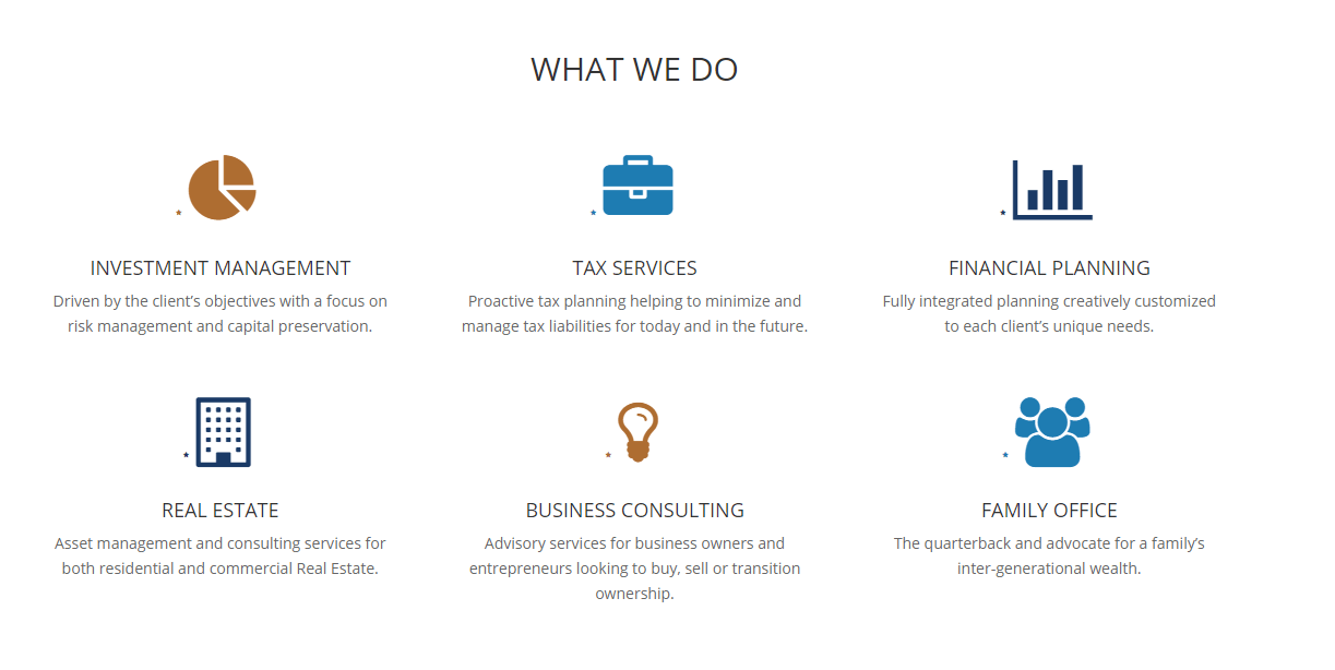
Below that is a list of services offered, showing you the full breadth of items Canal does.
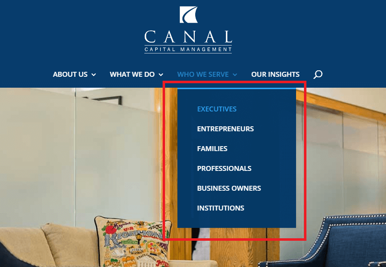
The Who We Serve sections shows visitors the different entities and customer archetypes they serve.
Thanks to great content and clear organization, Canal is among the leaders in the digital financial space.
Independent Wealth Management USA
IWMUSA.com is a clean, simple layout that gets right to the heart of the ethos of Independent Wealth Management.
Independent Wealth Management is a small, local team based in Traverse City, Michigan that gives potential customers a calming, hometown vibe.
IWM focuses on marketing their values and philosophical underpinnings in a way that endears a wider audience.

Independent Wealth Management offers multiple plan options for clients based on their unique financial needs, and has a proven track record of helping their clients’ portfolios grow.
Kulig Financial
Kuligfinancial.com is a woman-owned business that is killing it in the financial space. With fee-only financial planning and investment options geared towards a broad swath of clients, Kulig Financial is an outstanding resource for people who have questions or who need a full-on investment manager.
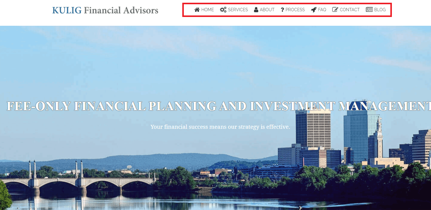
The use of icons on the top navigation is a nice visual touch, drawing attention to the area and encouraging people to click through to each option.
Then there’s the service page which gives way to “review our process,” where you are able to see the specific steps involved in Kulig’s workflow.
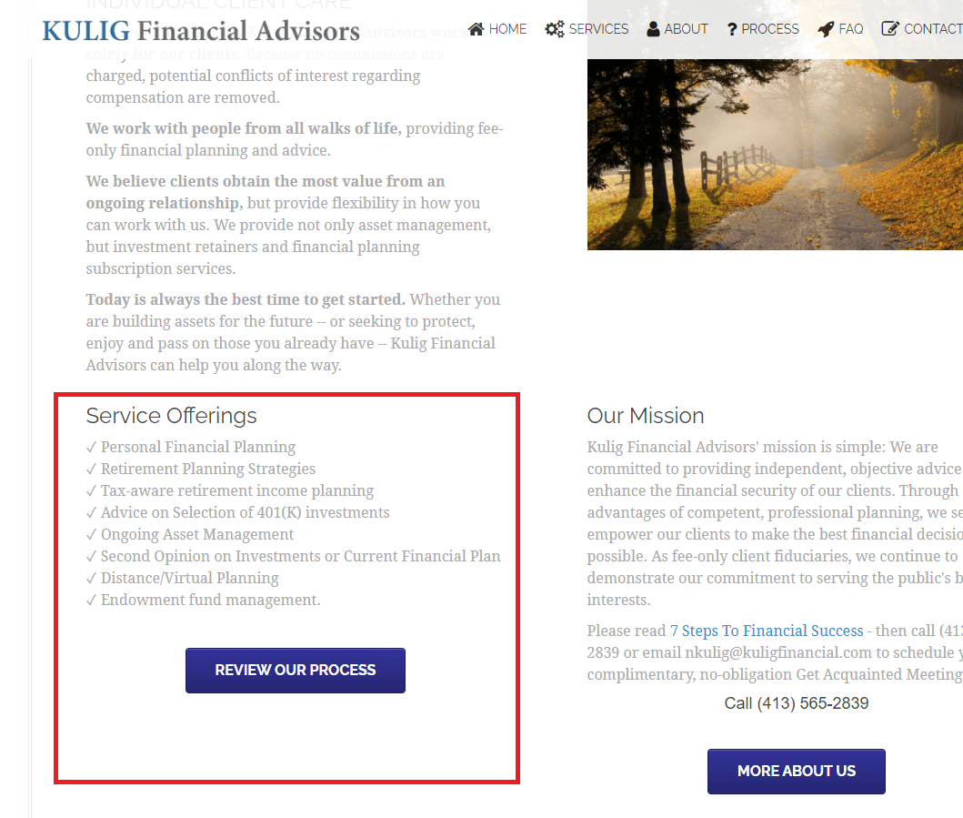
You can see what’s entailed when you partner up with Kulig as your trusted financial advisor. They also make it easy to get in touch with their team via phone, email or social media.
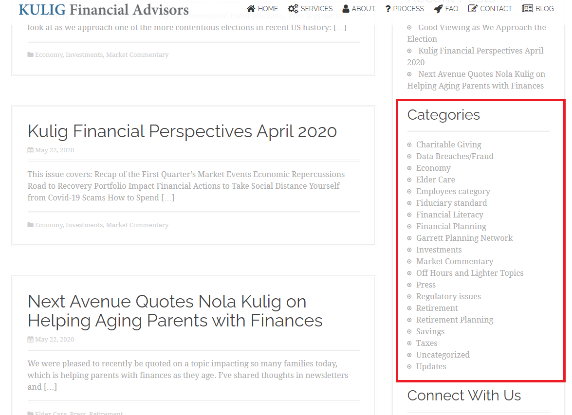
The blog layout is also quite useful, featuring a full list of categories for easy topical navigation. Quickly scan from topic to topic and get your questions answered fast.
Sustain Folio
Amidst the rise of robo-advisors, Sustainfolio.com is leading the charge. Their website makes it easy to explain the concept of building a low-cost investment portfolio built around environmentally-friendly businesses.

By combining investing with personal values, SustainFolio makes an appeal to human sensibilities.
Founder Dale Wannen’s extensive investing experience reveals an understanding of how to navigate sound investing strategies while remaining cognizant of the big picture.
The site capitalizes on video usage to illustrate the point, doing so in a professional yet personalized manner.
RWS Investment Planning
RWSInvestmentPlanning.com is an extremely simple design, but we mean that in the best possible way.
R.W. Stanley is an independent financial planning firm whose website resembles a landing page. The advantage of this? It gets people all the information they need in one fell swoop and catapults them through the sales funnel.
There’s also a useful YouTube video towards the bottom of the page highlighting their “Fee Only RIA.”
The resource page is another great place to go on this site, giving you tons of helpful articles and informational content to address your money questions.
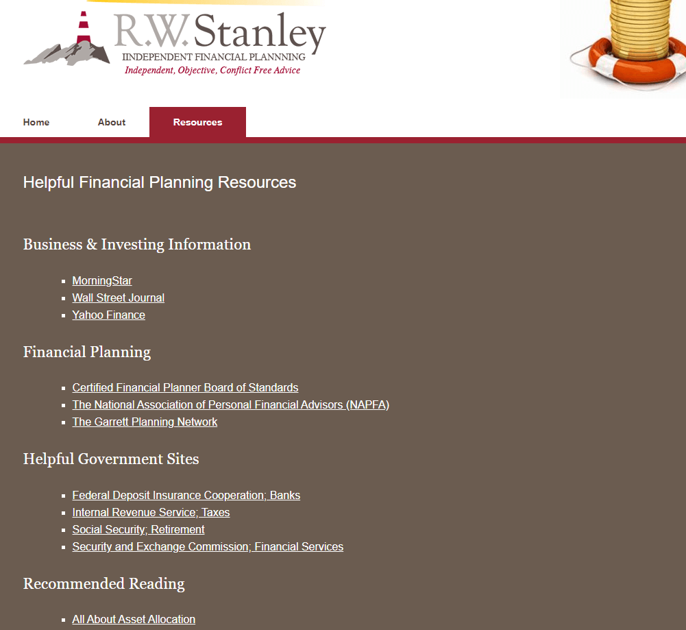
The list of resources and recommended readings will allow you to acquire knowledge on your own as well as reaching out to R.W. Stanley for personal investment help.
Enhance Your Financial Advisor Branding
A more functional, aesthetically pleasing website will go a long way in positioning you as a foremost financial expert in the space. The updated website will aid your customers from a user experience standpoint while also appeasing search engines along the way.
These web design creations are here to show you that finance doesn’t have to be a ‘boring’ topic anymore. Financial advisors across the web can implement a clean looking site into their digital branding arsenal and reap the rewards.

